Typography is a huge part of how people experience your website. It’s not just about picking a pretty font—it’s about making sure your text is easy to read, fits current trends, and serves the function of your design. In this post, we’ll cover why typography matters for readability, take a look at what’s trending in web fonts, and figure out how to balance style with functionality.
The Impact of Typography on Readability
First things first—readability is key. When someone visits a website, they need to be able to understand what they’re reading without a struggle. Poor font choices can make it hard for users to navigate content, and if people can’t read your text, they’ll just leave.
Here’s why typography matters for readability:
- Font Choice: A font that’s too fancy can look stylish, but it’s not always the best for body text. For paragraphs, go with something clean and simple, like sans-serif fonts. They’re easier to read on a screen, especially for long sections of text.
- Font Size: Too small? People will zoom in. Too big? They’ll scroll more than they want. Find a middle ground that works well across devices.
- Spacing: Pay attention to line spacing and letter spacing (also called leading and kerning). If the lines are too close together, the text feels cramped. Too far apart? It’s harder to follow. Find that sweet spot to make reading a breeze.
Making your text easy to read means your visitors can focus on the message, not the effort of reading. If they have to strain, they might bounce right off your site.

Trends in Web Fonts
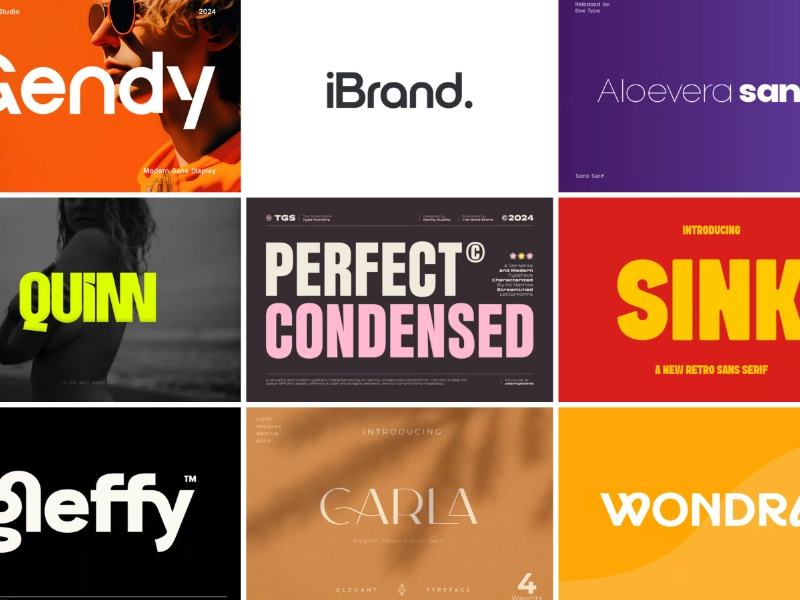
Just like everything else in design, web fonts have trends. Staying on top of these trends ensures your website looks fresh and modern. Here are some of the hottest typography trends right now:
- Variable Fonts: These are a big deal. With variable fonts, you can have multiple font styles and weights in one file, which cuts down on load times. It’s great for performance and flexibility!
- Minimalism Rules: Clean, minimalist fonts are in style. Sans-serif fonts like Helvetica, Arial, and Roboto are popular because they’re sleek and easy to read.
- Custom Fonts: Want to stand out? Custom or handwritten fonts are being used more for logos, headers, and special elements. They give a site personality while keeping body text simple and readable.
- Serif Fonts Are Back: Once mainly seen in print, serif fonts are now back in web design, especially for brands that want a more sophisticated or classic feel. You’ll see them on websites for luxury goods or editorial content.
Keep these trends in mind as you choose fonts, but always ask yourself: does it serve the user?

Balancing Style and Function in Design
Now here’s the tricky part—style vs. function. As a designer, you want your typography to look amazing, but it still has to be functional. Here’s how you can get the best of both worlds:
- Hierarchy Matters: Set up a clear visual hierarchy to guide readers through your content. Use different font sizes, weights, and styles to highlight headings, subheadings, and body text. Users should instantly know what’s important without having to guess.
- Contrast and Legibility: Don’t sacrifice legibility just to look cool. High contrast between the text and the background (like black text on a white background) is still the best option for readability. If users can’t read your text, all your hard design work won’t matter.
- White Space Is Your Friend: White space, also called negative space, helps break up your text and makes it easier to read. If everything is squished together, it looks overwhelming. Give your text room to breathe.
- Consistency Is Key: Use a consistent style throughout the site. If your headers, body text, and other elements have a cohesive look, your design will feel more polished and professional.
Good typography means finding a balance between looking great and making sure your website’s content is easy to read. And trust me, your visitors will thank you.

Conclusion
Typography isn’t just a design element; it’s a functional tool that affects how users experience your website. By focusing on readability, keeping up with trends, and balancing style with usability, you can make sure your site’s typography enhances the overall design, not hinders it.
Ready to improve the typography on your website?
At Bryckroad Creative, we can help you make the best font choices to elevate your design. Let’s work together to make your site both beautiful and functional!

